5
Battles -- Mirrored (2007)
 Battles' sound is incredibly difficult to define. While they are firmly rooted in math rock, their incredibly unorthodox and lighthearted style of composition defy easy description. Even now, there are dozens of aspects of their music I can't find the words to properly convey. That's what makes the cover of their 2007 debut Mirrored so compelling; there is something about the infinite nesting and repetition that speaks to the band's unusual sound many times more effectively than mere words could ever hope to. Taken on the set of their music video for "Atlas," photographer Timothy Saccenti's geometrically pleasing image has been embedded in the minds of indie rockers ever since its release. From the heavy electronic media set up, to the bright yellow drums, to the unergonomically high ride cymbal, this image has been entrenched with the core of math rock since its release.
4
Explosions in the Sky -- The Earth is Not a Cold, Dead Place (2003)
 Esteban Rey has long collaborated with Explosions in the Sky, and it's difficult not to recognize the characteristic levity and softness of his art that so well parallels the band's music itself. What's weird is that the cover art most recognized by fans of the genre and associated with Explosions in the Sky in general is, arguably, his least interesting piece. It's not the lone gondolier, nor the sea of white clouds, nor the house overgrown with kudzu that spring to mind, but merely a single phrase, repeated over and over. And maybe that really is fitting: nothing speaks better to the band's dedication to minimalistic rock than the isolation of some singular red text against a sea of black. It's such an effectively recognized image that its influence can be seen on other album covers--Canadian indie rock band Stars used a similar motif for the cover to their 2004 album Set Yourself on Fire, and Rey himself revisited the motif on the cover to Lazarus' Like Trees We Grow Up To Be Satellites (The Backwards America). When it comes to creating beauty out of only the barest minimum of parts, few images spring faster to mind.
3
Slint -- Spiderland (1991)
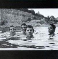
 The wide-angle-image-between-two-black-bars motif isn't anything new; the same design can be seen on albums from Pearl Jam's Yield to Rush's recent Snakes and Arrows Live. But then again, no other cover is as deeply entrenched with the genesis of a genre as that of Slint's farewell album, Spiderland. Will Oldham's photograph of the band treading water in a quarry immediately evokes feelings of stripped-down composition and bare recording--defining elements of the post-rock genre that were popularized by this album. Actually, the image is probably best recognized as paralleling U2's iconic album The Joshua Tree, and I'd say the comparison is fitting. Slint may not have been the first band in the genre, but with the release of Spiderland, they singlehandedly ushered in the age of its popularity and opened the floodgates for all of the bands that followed, and the top half of their heads are now irrevocably enmeshed with the beginning of an era.
2
Godspeed You! Black Emperor -- Lift Yr. Skinny Fists Like Antennas to Heaven (2000)
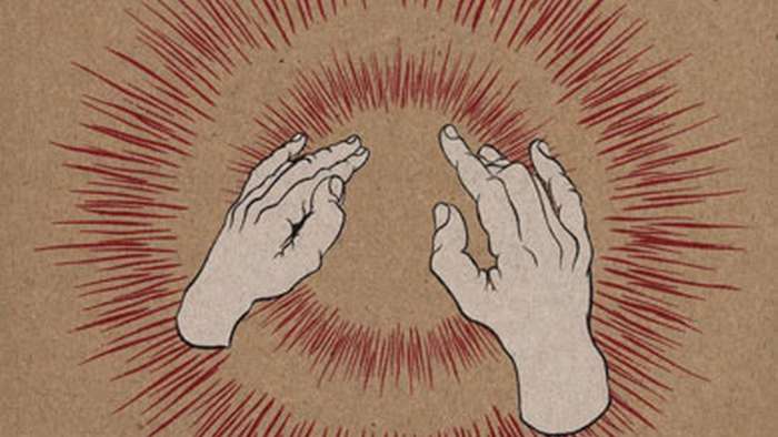
.jpg) Like any genre, there are a few hubs in the world for the post-rock scene--Chicago, Glasgow, and Reykjavík all have their distinctive flavours and styles. However, the best-known and, arguably, the most unorthodox locale for post-rock groups has to be Montréal. Most of the bands from that scene gathered on the Constellation label, and almost all of the acts on it are either directly or indirectly related to the biggest of them all, Godspeed You! Black Emperor. Combining elements of minimalism, chamber music and other classical genres with rock instrumentation, GY!BE set the defining tone for the Montréal sound of post-rock: a sparse, lethargic sound with unusual, often stringed instrumentation and an overwhelmingly cathartic and epic variety of songwriting. No image is more easily associated with the band than that of artist William Schaff's raised fists, which upon first glance appear to be rocking out in the most heavenly manner possible. Of course, as with all of their work, there's a deeper meaning to them--just a cursory glance through the packaging imbues the fists with a great amount of political symbolism, building on dystopian themes they explored throughout their whole career. However, it's hard to argue that any other one image, even merely on its surface interpretation, is as entrenched with the symphonic post-rock genre as the cover to Levez Vos Skinny Fists Comme Antennas to Heaven.
Like any genre, there are a few hubs in the world for the post-rock scene--Chicago, Glasgow, and Reykjavík all have their distinctive flavours and styles. However, the best-known and, arguably, the most unorthodox locale for post-rock groups has to be Montréal. Most of the bands from that scene gathered on the Constellation label, and almost all of the acts on it are either directly or indirectly related to the biggest of them all, Godspeed You! Black Emperor. Combining elements of minimalism, chamber music and other classical genres with rock instrumentation, GY!BE set the defining tone for the Montréal sound of post-rock: a sparse, lethargic sound with unusual, often stringed instrumentation and an overwhelmingly cathartic and epic variety of songwriting. No image is more easily associated with the band than that of artist William Schaff's raised fists, which upon first glance appear to be rocking out in the most heavenly manner possible. Of course, as with all of their work, there's a deeper meaning to them--just a cursory glance through the packaging imbues the fists with a great amount of political symbolism, building on dystopian themes they explored throughout their whole career. However, it's hard to argue that any other one image, even merely on its surface interpretation, is as entrenched with the symphonic post-rock genre as the cover to Levez Vos Skinny Fists Comme Antennas to Heaven.
1
Sigur Rós -- Ágætis Byrjun (1999)
 It's really amazing how much power one simple sketch could have. The cover to Sigur Rós' breakthrough album Ágætis Byrjun really isn't more than just an ink sketch with some filtering thrown on top of it. And yet, artist Gotti Bernhöft created an image that transcends Sigur Rós themselves--it's become the quintessential image of the post-rock genre. The deep blue, but not quite black, contrasted with the white-filtered drawing feels like the perfect image to capture the spacey, floating essence of post-rock's sound. It's easy to see the comparison to Clarke's star child--everything to the spectral washing of color to the fœtal positioning suggests not only some higher power than what's shown, but an imminent beginning. An alright start, if you will. Though bands like Tortoise and Don Caballero did their part to kick it off, Ágætis Byrjun was truly the first great album post-rock produced. If any one image could be identified as representing the genre as a whole, it would most certainly be this one.


