Graphs & Statistics
At the end of each year we like to take a look back over the past 12 months and examine what's happened, as well as chart the differences in our top record nomination process. Read on for a quick run through some of our stats for this year.
SPB's Content Count

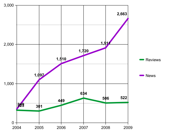
This graph shows SPB's content posting rate for the past year, plus the previous 5 years totals for comparison. News posting continues to rise, and album reviews pick up a little from last year's drop.
Record Nominations in Top 30

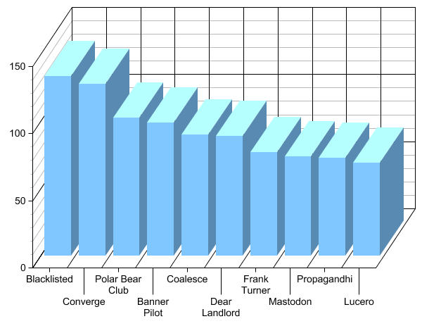
This graph shows the point scores for each record in our top 10. As you can see, Blacklisted and Converge were both pretty close to the #1 spot.
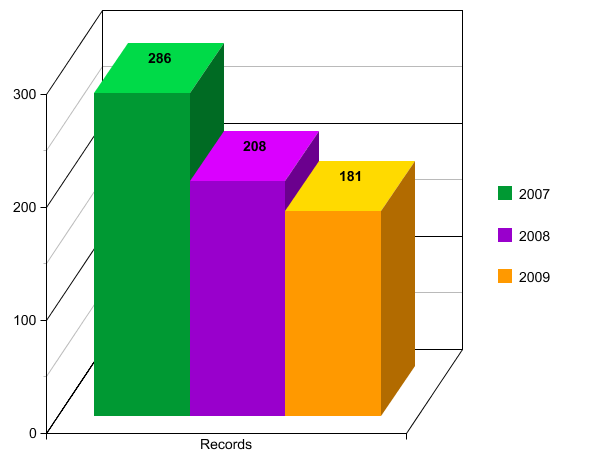
Number of records nominated for SPB's top 30 by writers

This year saw a record low in number of nominated records. Does this mean that SPB staff liked a more unified collection of records than in previous years, or that there weren't as many good records to nominate in 2009? You decide.


