Graphs & Statistics
It wouldn't be a SPB year end feature without some nerdy data. Enjoy.
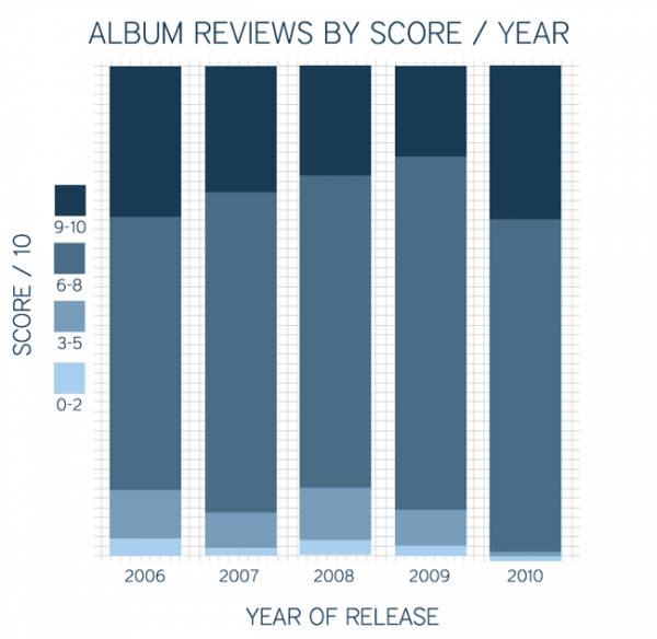
Album review score breakdown

This one is somewhat complex but makes for interesting reading. Each coloured area of the bars represents a group of album ratings from SPB - from light to dark it goes 0-2, 3-5, 6-8 and 9-10. The bigger that section of the bar, the more albums were rated in that score group. Each bar represents a year. We can see that 2010 has around double the number of high scoring (9-10) albums compared to 2009. Before that, the best year of the last 5 was in 2006. Do you agree? Let us know!
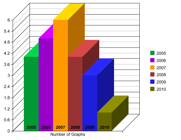
Here's one more graph for old time's sake. It's self explanatory.
Number of graphs in SPB year end features 2005-2010


